Contact us
Our team would love to hear from you.
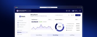
In a field where decisions often need to be made quickly and information is rarely perfect, data visualization is more than a reporting tool. It is a practical way to reduce uncertainty, support informed decision-making, and ultimately improve patient care.
This article explores healthcare data visualization, including its benefits, common types, use cases, tools, and implementation challenges.
The importance of data visualization in healthcare is driven by digitalization trends, growing data volumes, and the need to improve clinical, operational, and financial performance. Moreover, visualization helps make data usable in practice, as proven by evidence from implementation studies. These studies show that well-designed dashboards can improve both efficiency and task performance. For example:
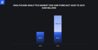

Source: Mordor Intelligence
Furthermore, artificial intelligence (AI) is pushing visualization from passive reporting toward systems that actively highlight what requires attention, such as risk or unexpected deviation.
Data visualization in healthcare is not defined by chart types alone, but by the analytical tasks they support. Some visualizations are designed for administrative and operational analytics, such as monitoring patient flow, staffing levels, bed occupancy, wait times, and costs. Others support clinical analysis, such as the tracking of vital signs, lab results, imaging findings, disease progression, and treatment response.
Data can be visualized through several broad categories that serve different analytical purposes in both operational decision-making and patient-centered clinical care.
| Examples | Main purpose | Common uses | |
|---|---|---|---|
| Trend and distribution analysis | Line/time-series charts, bar charts, histograms, box plots, scatter plots, heat maps | Reveal how metrics change over time, how values are distributed, and where deviations occur | Vital-sign trends, lab-result monitoring, readmission rates, patient volumes, treatment outcomes, length of stay, infection rates |
| Geographic and population-level visualization | Maps, choropleth maps, geographic heat maps | Show how health outcomes, disease spread, and access to care differ by location. Help healthcare and public health teams identify regional patterns, underserved areas, and health disparities | Disease outbreak tracking, vaccination coverage, access to сфку care, regional disease prevalence, health equity analysis |
| 3D anatomical visualizations | 3D organ models, anatomical reconstructions, surgical planning models | Make complex anatomy easier to understand than flat 2D images. Help clinicians examine spatial relationships, plan procedures, explain conditions, and reduce surgical uncertainty | Surgical planning, tumor reconstruction, orthopedic planning, cardiac anatomy, medical training |
| Operational and key performance indicators (KPI) dashboards | Interactive dashboards combining multiple visual components | Provide a consolidated view of key metrics for ongoing monitoring and decision-making | Operations dashboards, patient safety dashboards, clinical performance monitoring, patient education, public health campaigns, executive summaries |
| Predictive visualizations | Risk score dashboards, anomaly detection views, predictive trend charts, AI-generated summaries | Use AI and advanced analytics to surface patterns in large and/or fast-changing datasets. Help identify high-risk patients, detect unusual trends, explain contributing factors, and prioritize action | Readmission risk, early warning indicators, capacity forecasting claims risk, population health forecasting |
In healthcare, data visualization is less about making data “easy to understand” and more about making it usable under real-world conditions: time is limited, data is fragmented across systems, and decisions frequently involve risk.
Instead of reviewing multiple reports or raw tables, clinicians and administrators can quickly assess what has changed, what falls outside expected ranges, and what may require intervention. This reduces the time spent interpreting data, which is particularly critical in time-sensitive environments such as emergency care or capacity management.
Visuals are a universal language in healthcare, providing a shared reference point across teams. A well-structured chart or dashboard can help clinicians, administrators, and other stakeholders interpret medical data and collaborate effectively without relying on lengthy explanations. This is especially important when coordinating care, as breakdowns in communication are a leading cause of medical errors.
Hospital operations depend on continuously changing variables, including patient flow, bed availability, staffing levels, equipment usage, and resource utilization. Visual dashboards give healthcare organizations real-time insight into these factors, supporting data-driven decisions that improve efficiency and maximize resources.
By monitoring KPIs such as bed occupancy, patient wait times, staff utilization, equipment availability, and supply levels, healthcare teams can identify bottlenecks, improve scheduling, prevent stock-outs, reduce waste, and control costs.
Data visualization can translate complex medical information into clear, accessible formats, helping patients better understand their health and participate more actively in their care. Engaged patients are more likely to follow treatment plans and experience better health outcomes.
Data visualization also supports informed consent by presenting treatment options, risks, and benefits in a clear visual format, fostering stronger patient–physician relationships.

“The value of visualization in healthcare lies less in how data is presented and more in how it changes what gets noticed in the flow of daily work, especially when decisions should be made under time pressure and amid competing priorities.”
Healthcare Solutions Consultant
Data visualization supports many areas of healthcare, from direct patient care to hospital operations, financial management, and long-term planning. Below are some common healthcare data visualization examples.
Healthcare organizations rely on a mix of business intelligence platforms to build dashboards, reports, and analytical views. While many tools offer similar core capabilities, the differences become more apparent when applied to healthcare data, particularly in areas such as data integration, governance, security, interoperability, and scalability.
Below is a comparison of commonly used platforms, with a focus on how they perform in practical healthcare scenarios rather than on feature lists alone.
| Tableau | Domo | Microsoft Power BI | Qlik | Looker | |
|---|---|---|---|---|---|
| Ease of learning | Offers a drag-and-drop interface, with calculations that may feel familiar to users with experience in tools such as Excel or SQL. This makes it relatively approachable for new users | Provides a drag-and-drop interface that allows users to create visualizations, dashboards, and reports without writing code. Prebuilt connectors to common data sources simplify data import | Its similarity to Microsoft Excel makes it relatively easy to learn. However, users may need training to work with more advanced features, such as DAX | Can be more challenging than other tools because of its data modeling complexity and proprietary scripting language for data transformations and ETL | Provides a user-friendly interface and intuitive dashboarding. However, setup and customization often require SQL and LookML knowledge, which can be challenging for nontechnical users |
| Unique features | Its VizQL engine supports an intuitive visual analytics experience | Collaboration features such as sharing, comments, and mentions can support teamwork across departments | Offers features such as intelligent narratives and anomaly detection. It also integrates with the broader Microsoft ecosystem, including Microsoft Cloud for Healthcare | Supports multicloud and on-premises deployments, giving organizations flexibility in where and how they manage analytics infrastructure | LookML allows data teams to define and centralize business logic, metrics, and calculations, helping ensure consistent analytics across teams |
| Limitations | Performance depends heavily on data architecture, data volume, and the organization’s scaling approach | May be less flexible for highly customized or complex analytical workflows | Best suited for organizations already invested in the Microsoft ecosystem. Advanced modeling and customization may require specialized skills | May have a steeper learning curve, and visualization options can be less flexible than in some other BI tools | Setup and maintenance can depend heavily on data engineering resources |
| AI capabilities | Supports natural-language querying, automated insights, and guided data exploration | Offers embedded AI features for alerts, recommendations, and workflow insights | Supports AI-assisted report generation, summaries, anomaly detection, and natural-language querying | Offers predictive analytics, explainable models, and automated data exploration capabilities | Supports conversational analytics, automated query generation, and semantic search, depending on implementation and connected data infrastructure |
The complexity of medical data creates challenges that must be addressed for data visualization initiatives to be successful.
Healthcare organizations generate vast amounts of data from disparate systems and formats. These data silos make integration difficult, even when using high-performance platforms like SAP HANA. Effective data integration pipelines are crucial for consolidating information from various sources (EHRs, lab systems, imaging devices, wearables, etc.) while maintaining data quality, integrity, and accuracy. For these purposes, conformance to interoperability standards, such as FHIR (Fast Healthcare Interoperability Resources), is essential.
Healthcare data is highly sensitive and subject to strict privacy regulations, such as HIPAA in the US and GDPR in Europe. Visualizations must be designed with privacy and security at the core. Role-based access control (RBAC) ensures that a floor nurse, a department head, and a CFO each see only the data relevant to their function—a standard EffectiveSoft builds into every clinical dashboard from day one. By balancing actionable insights with de-identification and differential privacy, we protect patient confidentiality without sacrificing utility.
Creating visualizations that are both informative and easy to understand can be challenging. While clinicians require high-detail views that support diagnostic, monitoring, or treatment decisions, patients benefit from intuitive, simplified displays. A critical pitfall in this area is alert fatigue. Over-alerting in threshold-based dashboards can lead to clinicians ignoring vital signals. We apply user-centered design practices and iterative testing to ensure that alerts are meaningful and actionable, reducing uncertainty rather than adding to the noise. This approach ensures that visualizations provide a clear direction in high-pressure environments.
Because healthcare visualization projects involve sensitive data, clinical workflows, and strict compliance requirements, successful implementation depends on more than choosing the right dashboard tool.
We begin by engaging with stakeholders to thoroughly understand their data visualization goals, target audience, available data sources, and technical constraints. This involves conducting interviews, reviewing existing documentation, and analyzing sample data to understand the project context.
We work with clients to design and develop interactive prototypes of the visualization solution. This iterative process allows us to gather feedback early and often to ensure the final product meets the needs of all stakeholders. We adhere to user-centered design principles focused on usability, accessibility, and adherence to healthcare-specific design guidelines.
This phase addresses the technical complexities of integrating data from diverse sources. We develop pipelines that navigate the specific challenges of Epic, Oracle Health (Cerner), and other major EHR environments. By using interoperability standards like FHIR and rigorous data cleaning techniques, we ensure the visualization is fueled by accurate, high-quality data.
We carefully select the most appropriate technologies, frameworks, and tools for each project to maximize security and performance. Our development process follows Agile methodologies, with continuous testing and integration to ensure high quality and rapid iteration.
Our focus extends beyond technical deployment to include workflow integration and change management. We offer ongoing support and maintenance to ensure the long-term success of the project. Moreover, we provide training and documentation necessary to help clinicians and staff transition to new tools, ensuring the technology actually becomes part of their daily routine.
We believe data visualization is an ongoing process. We work with clients to evaluate the effectiveness of the solution and identify areas for further improvement or advancement. Supported by data, we refine visualizations to ensure they continue to meet the evolving needs of the healthcare organization.
For many years, we’ve been collaborating with healthcare companies, creating powerful data visualization solutions.
Our experts created an analytics platform and identified relevant KPIs to help a leading US healthcare provider with a vast network of clinics across the country obtain data-driven insights. Our team of business analysts conducted an in-depth study of the clinics’ operations to identify four KPI categories. Leveraging Power BI, we developed a custom dashboard to facilitate effective monitoring of the selected KPIs. We integrated the dashboard into the existing data warehouse infrastructure to enable real-time KPI visualization. The dashboard displays metrics over various periods in the form of a table, helping analyze trends and track progress.
EffectiveSoft developed a comprehensive system for managing the daily operations of an expanding US-based urgent care operator. According to the client’s requirements, our team incorporated scheduling functionality for medical staff and developed a robust reporting system with data visualization capabilities and support for exporting PDF and CSV files. Additionally, we integrated CPT/ICD data into the application’s database of medical codes and enhanced the notifications system with new features to improve the patient experience.
We built a reliable data warehouse and connected it to a Power BI analytics and reporting solution for a US-based managed healthcare services provider. The solution centralized and standardized data from multiple disconnected systems, creating a consistent foundation for reporting and analysis. With Power BI dashboards and reports, the client gained clearer visibility into healthcare operations while maintaining strong data integrity and reducing the risk of data loss. As a result, healthcare teams gained faster access to the insights they needed for informed decision-making.
Healthcare data visualization is changing the way we understand and use medical information, from clinical decision-making to patient care planning. While the opportunities for integration are great, success requires overcoming complex challenges such as data fragmentation and privacy requirements. With the right expertise, these hurdles become stepping stones to impactful insights that drive better healthcare outcomes. If you’re ready to unlock the potential of your healthcare data, connect with our team and explore how we can help you achieve your visualization goals.

Data visualization in healthcare is the graphical representation of complex medical data in charts, graphs, tables, dashboards, and other formats that allow users to quickly identify relevant insights and make decisions.
Healthcare data visualization goes beyond standard business reporting. Traditional BI tools usually focus on sales, operations, finance, or performance metrics, while clinical data visualization must handle patient outcomes, population health, claims data, and care delivery workflows on top of that.
In practice, healthcare dashboards need stronger data governance, role-based access, auditability, interoperability with systems like EHRs and data warehouses, and support for healthcare standards such as HL7 FHIR.
The cost of health data visualization varies depending on the specifics of the project and the tools used for data analysis and visualization. Since data visualization encompasses a range of solutions, you have numerous options when determining which tool best meets your requirements. Contact us for an estimate on your data visualization project.
The timeline usually depends on data complexity, number of systems to integrate, dashboard scope, security requirements, and how much clinical or operational logic needs to be built into the solution. A basic custom dashboard can often be delivered in a few weeks if the data sources are clean and requirements are clear. A more advanced solution may take several months, especially if it involves EHR integration, claims data, custom KPIs, predictive analytics, role-based access, or compliance reviews. Reach out to our team for a tailored project estimate.
At minimum, a data visualization solution for a healthcare organization should support HIPAA-aligned privacy and security controls when handling protected health information. Depending on the market and organization, healthcare teams may also need SOC 2, ISO 27001, GDPR, or regional healthcare privacy compliance.
Medical data visualization enables healthcare professionals to quickly evaluate vast amounts of data, allowing them to prescribe necessary therapies and care in the shortest possible time. This efficiency expedites recovery while minimizing the risk of complications.
Off-the-shelf solutions may be suitable when an organization needs standard dashboards quickly, has common reporting needs, and wants lower upfront implementation effort. Custom solutions, on the other hand, address certain needs, such as unique workflows, specialized clinical KPIs, multiple data sources, complex permissions, and deeper integration with existing systems. Connect with our experts for more information.
Yes. Data visualization tools can integrate with EHR systems, significantly enhancing how healthcare providers interpret and use patient data. Data visualization facilitates data centralization, supports clinical decision-making, enables patient outcome forecasting, improves patient engagement, and more.
Yes. Role-based customization is one of the most important requirements for healthcare dashboards. Common data visualization in healthcare examples include clinician dashboards for patient-level trends and care gaps, administrator dashboards for staffing and capacity, and executive dashboards for quality measures, financial performance, and patient outcomes.
Choose a vendor based on healthcare experience, data integration capabilities, security posture, compliance readiness, and customization options. A strong vendor should be able to connect with your EHR, data warehouse, claims systems, and other healthcare applications. They should also support role-based access, audit logs, data governance, HIPAA-aligned controls, and healthcare interoperability standards such as FHIR. Begin by checking out relevant case studies.
EffectiveSoft provides the balance of technical rigor and healthcare experience. We move beyond basic reporting to build tools that actually improve decision-making. Applying a structured engineering mindset, we ensure data from disparate sources (EHRs, labs, wearables) is integrated accurately and securely. We specialize in complex integrations, including AI-driven predictive modeling and 3D medical imaging, ensuring your platform can handle demanding clinical requirements. Using design thinking, we eliminate “dashboard fatigue.” Our design team creates direct, intuitive interfaces that allow providers to identify critical trends in seconds. We also ensure every solution meets strict HIPAA/GDPR standards without sacrificing performance.
Yes. Our commitment doesn’t end at deployment. We provide comprehensive maintenance and support services to ensure your healthcare solutions remain stable, secure, and compliant.
AI can enhance healthcare data visualization by detecting anomalies, forecasting trends, identifying high-risk patients, generating plain-language summaries, and helping users prioritize the most important changes in large datasets. For example, AI-enabled dashboards can support readmission risk analysis, early warning systems, population health forecasting, and operational demand planning. However, AI-powered visualizations should be explainable, validated, monitored for bias, and used to support—not replace—clinical judgment.
We envision the future of data visualization in healthcare as closely linked to the latest technologies.
AI and ML help detect anomalies, enable automated insights and predictions, prioritize risks, and surface patterns that may be difficult to identify manually. When designed responsibly, AI-assisted visualization can support faster decision-making without replacing clinical judgement.
Virtual and augmented reality (VR and AR) facilitate immersive and interactive experiences in data analysis. Healthcare professionals can use VR to better understand and make decisions about complex anatomical systems, medical procedures, and treatment outcomes.
Real-time data streaming allows healthcare practitioners to view and analyze data as it is created, resulting in proactive and timely treatments.
Can’t find the answer you are looking for?
Contact us and we will get in touch with you shortly.
Our team would love to hear from you.
Fill out the form, and we’ve got you covered.
What happens next?
San Diego, California
4445 Eastgate Mall, Suite 200
92121, 1-800-288-9659
San Francisco, California
50 California St #1500
94111, 1-800-288-9659
Pittsburgh, Pennsylvania
One Oxford Centre, 500 Grant St Suite 2900
15219, 1-800-288-9659
Durham, North Carolina
RTP Meridian, 2530 Meridian Pkwy Suite 300
27713, 1-800-288-9659
San Jose, Costa Rica
C. 118B, Trejos Montealegre
10203, 1-800-288-9659