Contact us
Our team would love to hear from you.
The Open Platform held its first design contest, inviting designers worldwide to reimagine the main screen of the Wallet mini-app within Telegram. The design concept prepared by our UX/UI designer Evgeny Dubitski who entered the winners list in the 3rd place.
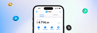
Wallet is a Telegram bot and a crypto wallet within the app. With Wallet, you can buy, sell, and exchange crypto, as well as send TON and USDT directly via Telegram chats.
The main task was to redesign the main screen of Wallet.
There were a lot of requirements, such as consistency with the existing Telegram UI, simplified navigation, reconsidered separation between Wallet / TON Space, and incorporated space for new assets, features, and promo campaigns.
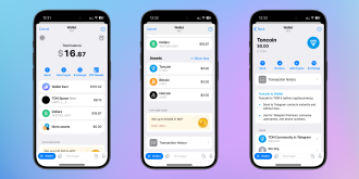

Screens of the current Wallet app (iOS).
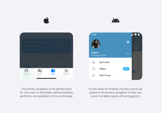
After conducting a small usability testing session, the hypothesis that users find it difficult to find Wallet in the app’s navigation was confirmed. This problem can especially affect user experience for new users. Therefore, it was decided to redesign the entry point as an additional usability improvement.


A hypothesis was that the best place for new users to easily find Wallet was the main navigation. Navigation patterns for both platforms are different. And new entry points make the solution intuitive while maintaining consistency of Wallet within Telegram.

Wallet and TON Space are connected with Telegram and use data from Telegram accounts. Therefore, just like in any mini-app, a user needs to accept the terms of the user agreement first.
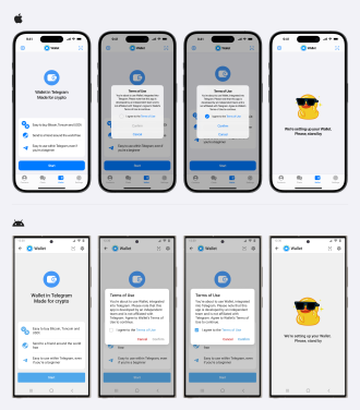

If we look at the Wallet’s design as a whole, it’s good, but there are some aspects to refine.
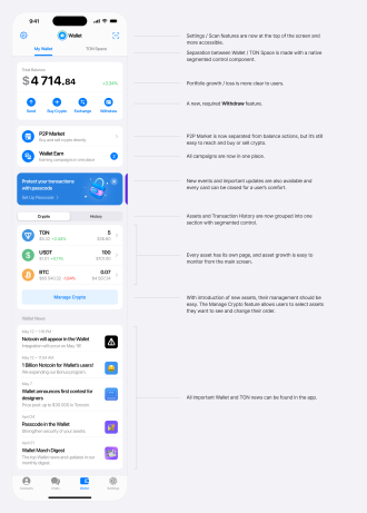

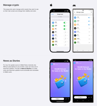

In the current design, it is quite difficult to track asset prices. To fix this, a separate asset page with a simplified price chart was added. Moreover, users can view the latest news about a specific asset and access more detailed information. Thus, users can make buying or selling decisions without having to leave Wallet.
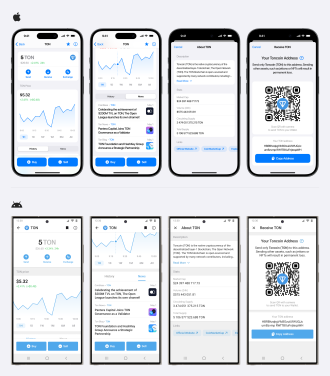

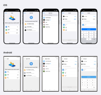
The asset transfer flow has been improved and refined. Now, users can specify the maximum amount when sending an asset without having to enter the number manually.

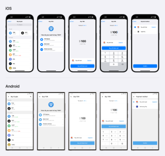
The buying flow has also been improved and refined.

The competition was quite exciting and challenging. There were many participants with different backgrounds, so it was a great honor to take one of the winning prizes.
Within a week, we conducted a usability testing and designed 63 screens for iOS and Android platforms. The second session of usability testing was conducted, showing good results.
Our team would love to hear from you.
Fill out the form, and we’ve got you covered.
What happens next?
San Diego, California
4445 Eastgate Mall, Suite 200
92121, 1-800-288-9659
San Francisco, California
50 California St #1500
94111, 1-800-288-9659
Pittsburgh, Pennsylvania
One Oxford Centre, 500 Grant St Suite 2900
15219, 1-800-288-9659
Durham, North Carolina
RTP Meridian, 2530 Meridian Pkwy Suite 300
27713, 1-800-288-9659
San Jose, Costa Rica
C. 118B, Trejos Montealegre
10203, 1-800-288-9659